Customization
In this guide we are going to learn how to customize the appearance of the Apto Web PCI SDK. The Web PCI SDK offers a series of CSS selectors that can be used to fully customize the appearance of the card.
Default themes
If you don't want to spend time designing a custom look you can choose one of the two default themes: light or dark.
The PCI SDK doesn't come with any predefined card background colours, in these examples we chose beige for the light theme and black for the dark theme.
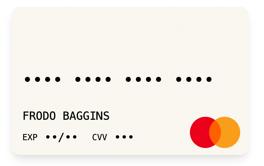

The Web PCI SDK comes with a set of default styles when displaying the card details:
All of those can be overriden by supplying a custome theme.
You can either build on top of the default light and dark themes by setting the extends property on your theme object:
const myTheme = {
    extends: 'dark',
};
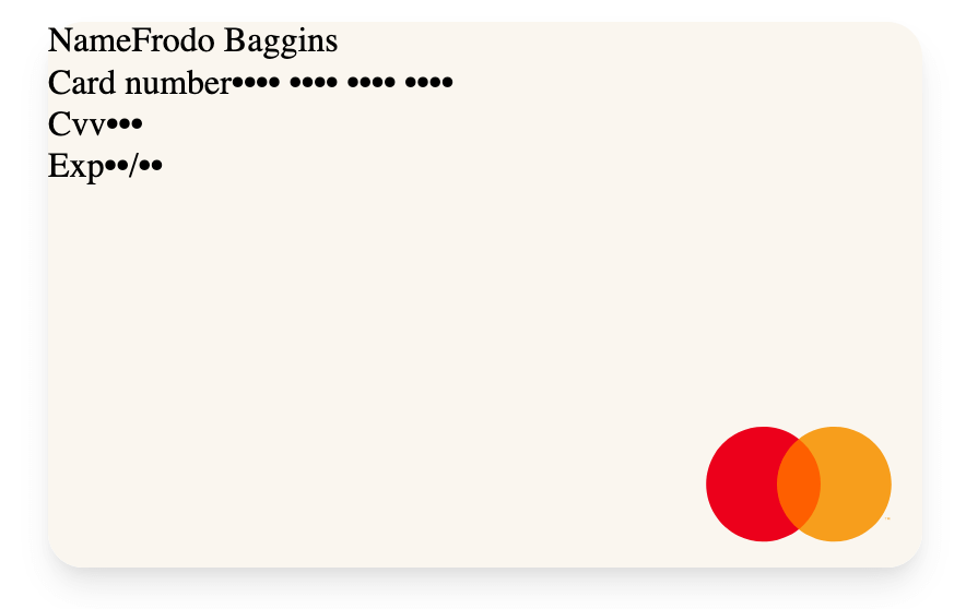
or ignore the default styles and then build the view from scratch:
const myTheme = {
    // not using `extends`
};
PCI Structure
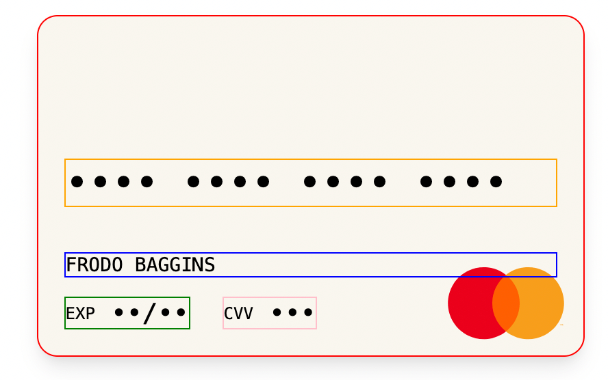
The PCI SDK Web is made up of 4 groups and a global container. Each group has a label and a value.
const myTheme = {
    extends: 'light',
    container: {
        border: '1px solid red',
    },
    groupPan: {
        border: '1px solid orange',
    },
    groupName: {
        border: '1px solid blue',
    },
    groupExp: {
        border: '1px solid green',
    },
    groupCvv: {
        border: '1px solid pink',
    },
};
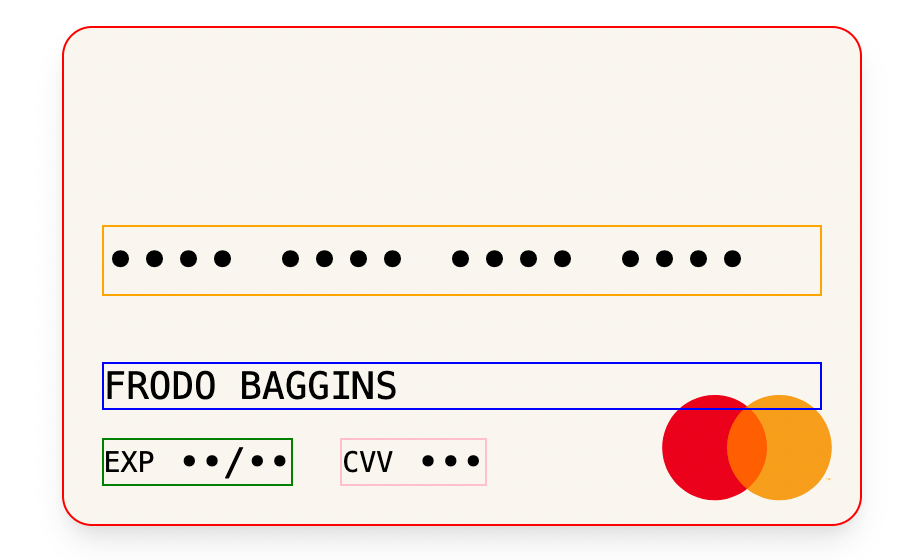
It is important to note that the styles that are applied to the global container are inherited in each of the groups.
It is also common for the container to occupy 100% of the available space. It is also recommended to use vw units so that the appearance is identical regardless of the size of the screen where the Web PCI SDK is loaded.
const myTheme = {
    extends: 'light',
    container: {
        border: '1px solid red',
    },
    groupPan: {
        border: '1px solid orange',
    },
    groupName: {
        border: '1px solid blue',
        fontSize: '3.5vw', // '14px'
    },
    groupExp: {
        border: '1px solid green',
        fontSize: '3vw', // '12px'
    },
    groupCvv: {
        border: '1px solid pink',
        fontSize: '3vw', // '12px'
    },
};
We can apply a common style to all labels through the labels property:
const myTheme = {
    extends: 'light',
    container: {
        border: '1px solid red',
    },
    groupPan: {
        border: '1px solid orange',
    },
    groupName: {
        border: '1px solid blue',
        fontSize: '3.5vw', // '14px'
    },
    groupExp: {
        border: '1px solid green',
        fontSize: '3vw', // '12px'
    },
    groupCvv: {
        border: '1px solid pink',
        fontSize: '3vw', // '12px'
    },
    labels: {
        color: 'violet',
    },
};
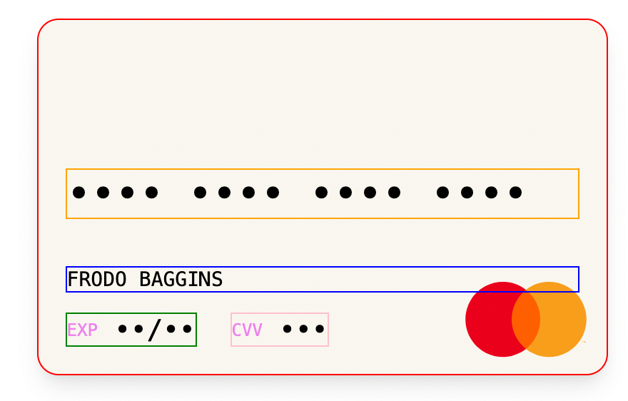
Notice now how the EXP and CVV labels are now violet. By default, on the default themes, the labels for the PAN and the cardholder name are not shown, you can make them appear like so:
const myTheme = {
    extends: 'light',
    labelPan: {
        display: 'block',
    },
    labelName: {
        display: 'block',
    },
};
We can also apply styles to individual labels. For example, we can use labelCvv and labelExp to style the CVV label and expiry date label, respectively:
const myTheme = {
    extends: 'light',
    container: {
        border: '1px solid red',
    },
    groupPan: {
        border: '1px solid orange',
    },
    groupName: {
        border: '1px solid blue',
        fontSize: '3.5vw', // '14px'
    },
    groupExp: {
        border: '1px solid green',
        fontSize: '3vw', // '12px'
    },
    groupCvv: {
        border: '1px solid pink',
        fontSize: '3vw', // '12px'
    },
    labels: {
        fontSize: 'bold',
    },
    labelCvv: {
        color: '#00796B',
    },
    labelExp: {
        color: '#1976D2',
    },
};

In this way, you can keep adjusting your theme until it suits your product requirements.
A complete reference for all properties is available in the Web PCI SDK ITheme object documentation.
Changing the inline form
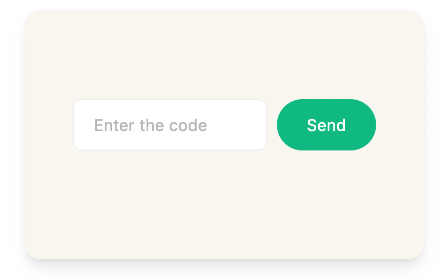
Sometimes the PCI SDK displays an inline form, for instance when the user needs to authenticate inserting an OTP code or wants to change the card's PIN:
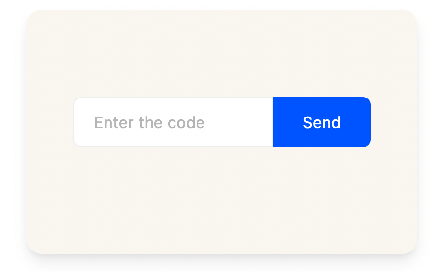
This inline form is fully customizable via theming in case you want to make it match your product's brand:
const myTheme = {
    extends: 'light',
    inlineForm: {
        container: {
            // the form element surrounding both the input and the submit button
        },
        input: {
            // the input element
        },
        submit: {
            // the submit element
        },
    },
};
For instance, if we wanted the input and submit elements to be separate and have a different color and border radius, we could do:
const myTheme = {
    extends: 'light',
    inlineForm: {
        input: {
            borderRadius: '2vw', // '8px'
        },
        submit: {
            backgroundColor: '#10B981',
            borderRadius: '12.5vew', // '50px'
            marginLeft: '2.94vw', // '10px'
        },
    },
};